THE BRAND
BedLoop breathes design and innovation, with a different personality. Our visual communication style should help convey commitment and professionalism to our clients. A corporate image has been created for BedLoop that contains all the values we want to express through the brand.
Innovation
As a company related to technology, innovation is one of the fundamental pillars of the industry and BedLoop aims to go further than the competition to provide our customers with the best experience.
Growth
We grow with quality, so we offer a personalized service and pay attention to all those proposals which aim to improve the platform.
Stability and Knowledge
BedLoop is a consolidated brand with more than 20 years of experience in the tourism sector.
Progress
IT Team in constant training focused on evolving the sector and offering the best product.
Seriousness
We offer our clients a personalized, human and professional treatment, in line with their expectations.
THE COLOR
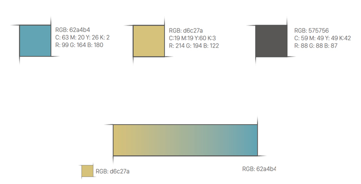
Color defines a scenario of specific emotional values that we must consider in its application to any communication medium.
The main colors of the BedLoop logo and symbol are RGB(62a4b4) and RGB(d6c27a).


CONSTRUCTION AND APPLICATION
Modulation
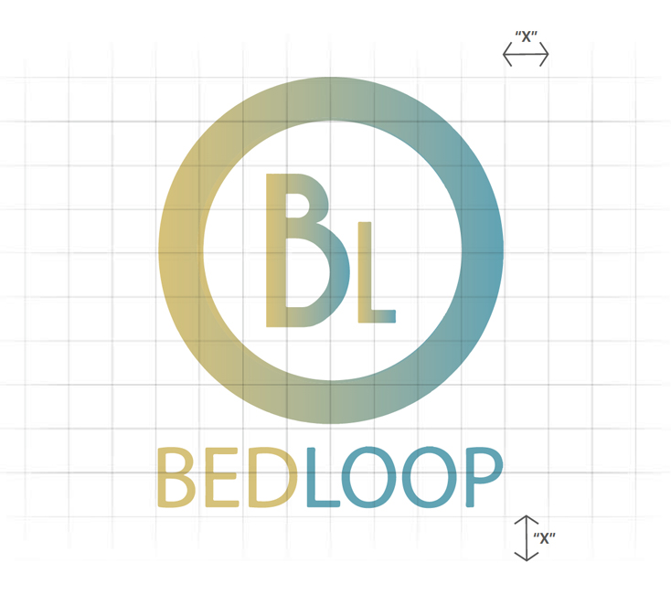
The BedLoop logo is inserted in a modular surface of 8x10 proportions. The value "X" is a modular surface of 8x10 proportions. This value defines the unit of measurement. Thus, we ensure the correct proportion of the brand on any support and measures.
Protection area
A protection area has been established around the logotype and logo. This area must be free of graphic elements that interfere with the perception and reading of the brand. The construction of the area of respect is determined by the measure "X", whenever possible, it is preferable to maximize this space by separating the logotype from the rest of the elements on the page (texts and images).
Download our complete BedLoop Identity Manual
Enter your e-mail and you will receive our identity manual.