
Brand Assets
BedLoop Brand Identity Manual
THE BRAND
BedLoop breathes design and innovation, with a distinct personality. Our visual communication style should help convey commitment and professionalism to our clients.
Innovation
As a technology-related company, innovation is one of the sector's core pillars, and BedLoop aims to go further than the rest of the competition.
Growth
We grow through quality, which is why we offer personalized service and pay attention to every proposal aimed at improving the platform.
Stability and Expertise
BedLoop is an established brand with over 20 years of experience in the tourism industry.
THE COLOR
Color defines a set of specific emotional values that must be considered in its application across any communication medium.
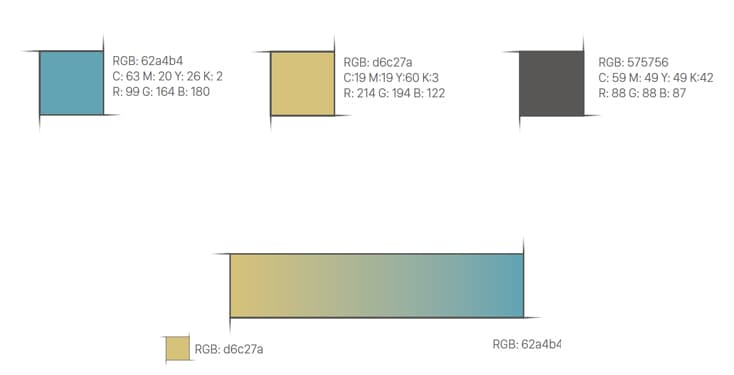
The main colors of the BedLoop logo and symbol are:
#62A4B4 (Corporate Blue)
#D6C27A (Corporate Gold)
CONSTRUCTION AND APPLICATION
Modulation
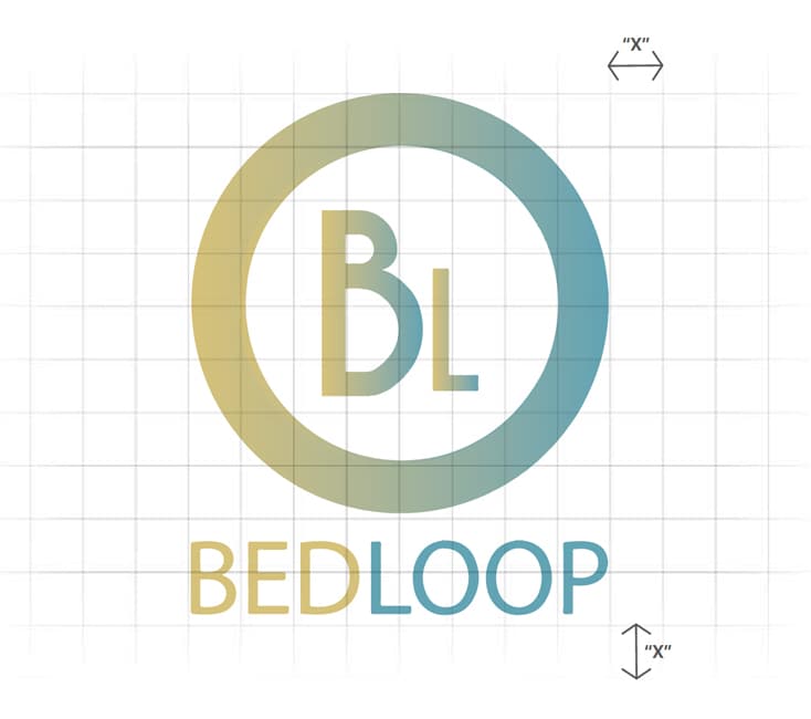
The BedLoop logo is built on a modular grid with 8x10 proportions. The value "X" establishes the unit of measurement.
Clear space
A clear space has been established around the logo and logo + wordmark. This area must be kept free of graphic elements that could interfere with its perception.